About Me
Data analyst with 10+ years of experience in public-sector research, spatial analytics, and dashboard development. Skilled in translating messy data into actionable insights using SQL, Python, Tableau, Excel, and ArcGIS. Experienced with statistical modeling, causal inference, regression analysis, and experimental design to support decision-making and policy evaluation.
Projects
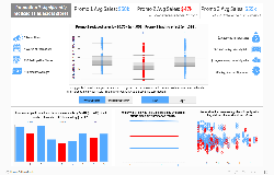
Evaluating Promotion Effectiveness with A/B Testing and Interactive Visual Analysis
Measured the impact of promotional strategies using Python and Tableau
- Analyzed sales across three promotional strategies to identify which performed best using regression modeling and log-transformed data
- Created a user-friendly Tableau dashboard with toggle buttons to switch between raw vs. log sales and include or exclude outliers
- Compared multiple models to show how outliers and data skew affect promotion results, market size trends, and statistical fit
- Used KPI cards, boxplots, and bar charts to communicate findings clearly, highlighting a 23% drop in sales under Promotion 2
View Full Project →
Jump to:
Python Code |
Dashboard
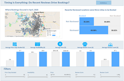
Airbnb Booking Analysis and Visualization
Measured how recent reviews affect booking rates using SQL, Python, and Tableau.
- Built end-to-end analysis using SQL, Python, and Tableau
- Created a booking measure from raw availability data
- Matched listings to reduce bias and compare fairly during analysis
- Listings with recent reviews were 15.8% more likely to be booked
View Full Project →
Jump to:
SQL Code |
Python Code |
Dashboard
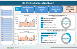
Sales Data Analysis and Excel
Analyzed sales and returns using Python and Excel.
- Cleaned and organized over a million transaction records, tagged returned orders, and standardized text fields
- Enforced a 1:1 mapping of stock codes and descriptions to ensure data consistency for reporting
- Created key measure to capture core business KPI: Total customers, total orders, total sales, total returns.
- Discovered that the top five returned products account for 38%of all returns, highlighting a need to evaluate those products.
View Full Project →
Jump to:
Python Code |
Dashboard
GIS
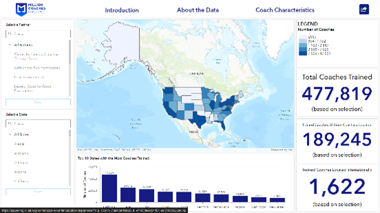
Million Coaches Challenge Dashboard
Built an interactive dashboard for the Million Coaches Challenge, which shows a choropleth map of where coaches in the US are and who they are partnered with. The dashboard also contains additional charts and indicators showing which states have the greatest number of coaches, as well as the total number of coaches in the US.
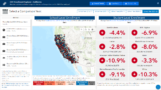
COVID-19 and Equity in Education Explorers
Built a series of interactive dashboards exploring the impact of COVID-19 and school enrollment, graduation rates, and absenteeism for California, Florida, New York, Tennessee, Texas, and Washington. These dashboards allow users to display data across multiple years, filter the data based on school, district, and student characteristics, and compare student subgroups (e.g., FRPL eligible, race/ethnicity). The 18 total dashboards can all be accessed through a man landing page that allows the user to select which topic to explore and which state to view.

Colorado Department of Education Teacher Mobility Dashboard
In a partnership with the Colorado Department of Education, developed 8 dashboards to answer essential questions regarding teacher shortages. The dashboards included key data on schools, districts, and the communities they resided in to help understand how factors such as educator attrition and socioeconomic status might impact teacher shortages. Teacher supply and demand was explored using Educator Prep Program graduation data and school district level hire counts. The state will use these dashboards to work with stakeholders to better understand their schools, districts, and communities and create initiatives to address teacher shortages that are unique to their individual situations.
With similar partnerships, built teacher mobilty dashboards for ME, HI, LA, and OH.